The Ad Placeholder sizes and HTML
We will create some ad placeholders for the most used sizes according to the internet. For each shape determined by the sizes below we will create the CSS and HTML for a placeholder. This article is an additional article to the CLS Issue created by loading ads which provides a simple solution to this issue and uses ad placeholders to fill up the empty space.
- 300 x 250 - Medium Rectangle
- 336 x 280 - Large Rectangle
- 250 x 250 - Square
- 200 x 200 - Small Square
- 728 x 90 - Leaderboard
- 468 x 60 - Banner
- 300 × 600 - Wide Tower
- 160×600 - Wide Skyscraper
- 970 x 90 - Thin Banner
- 320 x 100 - Short Banner
The ad pace holders are used as a backup plan for when ads are not loaded for a user and in order to fill the empty space created we can use some nice ad placeholder. The empty space is created because of the reserved space on the page for the ads, in some cases the program that determines what ads to be displayed does not find an ad and it does not display anything, here is where the ad placeholders are used.
We will use the same HTML for all placeholders and will only change the CSS and the text inside the placeholder. For placeholders that require different HTML the HTML will be displayed right below the CSS.
The HTML
<div class="placeholder">
    <span>Ad Placeholder</span>
</div>
300 x 250 - Medium Rectangle
The CSS
.placeholder{
    width: 300px;
    height: 250px;
    border: solid 0px transparent;
    border-radius: 5px;
    background: rgb(84,217,213);
    background: linear-gradient(0deg, rgba(84,217,213,1) 0%, rgba(60,147,207,0.6559873949579832) 100%);
    -webkit-box-shadow: 0px 0px 5px 0px rgba(67,66,69,1);
    -moz-box-shadow: 0px 0px 5px 0px rgba(67,66,69,1);
    box-shadow: 0px 0px 5px 0px rgba(67,66,69,1);
    text-decoration: none;
    position: relative;
    z-index: 1;
}
.placeholder span{
    line-height:230px;
    text-align: center;
    display: block;
    font-weight: bold;
    font-size: 25px;
    color: white;
    position: relative;
    letter-spacing: 0.02em;
    text-transform: uppercase;
    text-shadow: 0.01em 0 0.15em  rgba(128,128,128,1);
    user-select: none;
    white-space: nowrap;
    filter: blur(0.007em);
}
The final result:

336 x 280 - Large Rectangle
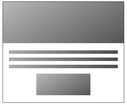
An animated placeholder mimicking a nice shine effect.
The CSS
.placeholder-1{
    width: 336px;
    height: 280px;
    text-decoration: none;
    position: relative;
    z-index: 1;
    border: solid 1px black;
    background: #ffffff;
}

.placeholder-1 .top-part{
    width: 100%;
    height: 115px;
    background-color: #d7d7d7;
    background-image: linear-gradient(147deg, #d7d7d7 0%, #353535 80%);
    background-size: 200% 200%;
    animation: traverse 3s ease infinite;
    margin-bottom: 20px;

}

.placeholder-1 .line{
    width: 90%;
    height: 10px;
    background-color: #d7d7d7;
    background-image: linear-gradient(147deg, #d7d7d7 0%, #353535 80%);
    background-size: 200% 200%;
    animation: traverse 3s ease infinite;
    margin: 0px auto 10px auto;
}

.placeholder-1 .line:last-child{
    margin-bottom: 40px;
}

.placeholder-1 .button{
    width: 150px;
    height: 60px;
    background-color: #d7d7d7;
    background-image: linear-gradient(147deg, #d7d7d7 0%, #353535 80%);
    background-size: 200% 200%;
    animation: traverse 3s ease infinite;
    margin: 15px auto 0px auto;
}

@keyframes traverse {
    0% {
            background-position: 200% 0%;
    }
    50% {
            background-position: 200% 25%;
    }
    100% {
            background-position: 0% 0%;
    }
}
The HTML
        <div class="placeholder-1">
            <div class="top-part">

            </div>

            <div class="line"></div>
            <div class="line"></div>
            <div class="line"></div>

            <div class="button"></div>
        </div>
The final result:

In future updates to the articles content we will add example for all ad sizes listed at the top of the article.
Image by rawpixel.com on Freepik
Comments (0)